What Is a Landing Page and How Do You Build One? A Conversion-Focused Guide
A landing page is a page built for ads and campaigns that guides the visitor to a single action. A conversion-focused guide to structure, headline, form, trust signals, A/B testing and measurement.
 Melis Ay ÜreğenSoftware Engineer16 min read
In Brief
A landing page is a page built to send a visitor arriving from an ad, email or link toward a single goal (filling out a form, buying, signing up, calling), free of distracting elements. A clear headline, benefit-focused content, trust elements, a single call to action, a short form and a fast mobile experience raise the conversion rate.
- A landing page should have one purpose and one call to action; menus and unnecessary links distract.
- The message on the page must exactly match the ad or link that brought the visitor; any gap between the promise and the content lowers conversion.
- A page isn’t built once and left alone; the conversion rate is improved continuously through measurement, A/B testing and small refinements.
Table of Contents
Imagine you click on an ad. Should it take you to the brand’s general home page, with all its products and menus, or to a page that describes exactly the product or offer mentioned in that ad and shows you one thing to do? A landing page is the tool for that second approach. This dedicated page is called a landing page; in Turkish it is known as “açılış sayfası” (opening page) or “iniş sayfası” (touchdown page).
In this article we answer the questions what is a landing page and how do you build one: its definition, how it differs from a home page, its types, why you need one, the page structure section by section, writing headlines and copy, form design, visuals and trust elements, speed and mobile compatibility, alignment with the ad, legal requirements, A/B testing, measurement, tools and common mistakes. For anyone searching for “landing page examples,” we also give a sample scenario and a checklist.
What is a landing page?
A landing page is a single-purpose web page where a person first “lands” after clicking an ad, email, social media post or search result, designed around a specific goal. The goal might be filling out a form, requesting a quote, buying a product, signing up for a newsletter, starting a trial, downloading an app or making a phone call.
Literally, “landing” means touching down; the visitor “lands” on the page and the action expected of them is clear. When many people search for “what does landing page mean,” they mean this single-goal, campaign-specific page format. In a broad sense, the entry page of any site could be called a “landing page,” but in marketing, the term refers to conversion-focused dedicated pages.
How it differs from a home page
| Feature | Home page | Landing page |
|---|---|---|
| Purpose | Introduce the business in general and send visitors to different sections | Focus on a single goal (conversion) |
| Navigation | Many menus and links | Usually no menu, or a very limited one |
| Message | Broad, covers many topics | Narrow, one offer and one message |
| Call to action | Can be several | A single, prominent one |
| Traffic source | Mixed: search, direct, social media | A specific ad, email or campaign |
| Measure of success | Visits, navigation, overall engagement | Conversion rate |
A home page is the entrance to a store; visitors wander and choose. A landing page is the signpost that takes someone who came to buy a particular product straight to that product’s shelf.
Why do you need a landing page?
- Increases conversion: With fewer distracting elements, the visitor is more likely to reach the goal.
- Raises ad efficiency: A page that delivers exactly what the ad promised keeps the cost per click from going to waste. When Google Ads calculates the 1–10 Quality Score, it evaluates landing page experience together with expected click-through rate and ad relevance (Google Ads Help; our Google Ads guide).
- Makes measurement easier: On a single-goal page, it is clear what each campaign delivers.
- Enables testing: It becomes easier to try different headlines, images and offers.
- Tailors to the target audience: Different messages and pages can be prepared for different audiences.
- Collects leads: Contact details such as email and phone number form the start of the sales process.
Types of landing pages
- Lead generation page: Offers the visitor a benefit in exchange for contact details (a quote, a free consultation, an e-book, a newsletter, a trial). Very common for B2B services and high-ticket sales.
- Click-through page: Warms the visitor up and sends them on to the actual purchase or quote page; used in e-commerce and product promotions.
- Sales page: Usually a longer page that explains every aspect of the product or service and leads directly to purchase.
- Registration and event page: For webinar, training, event or seminar sign-ups.
- App download page: A page that promotes a mobile app and provides store links (see our mobile app guide).
- “Coming soon” and waitlist page: Gathering interest for a product that hasn’t launched yet.
- Thank-you page: The page shown after a form is submitted; it explains the next step and serves as a conversion point for measurement.
A conversion-focused page structure
The sections of a landing page answer the questions in the visitor’s mind in order: “What is this place? What’s in it for me? Can I trust it? How does it work? What if something goes wrong? What should I do now?” The sections below build that flow:
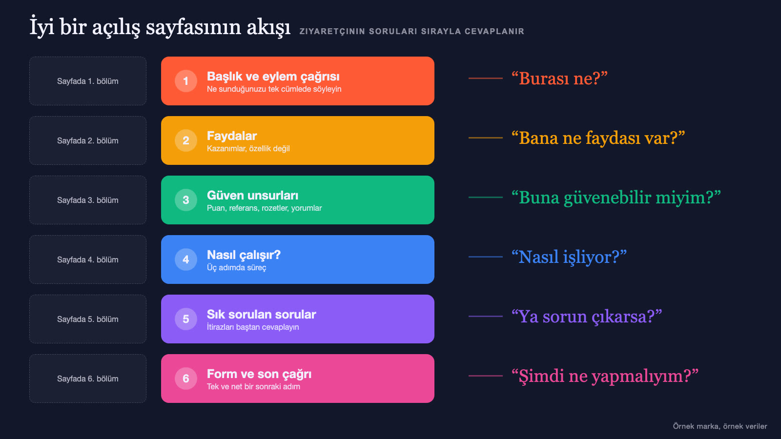
1. Headline and subheadline
The headline is the page’s most important element; in the first seconds it tells the visitor what they’ve found and why they should stay. A strong headline describes the benefit (not the feature), is clear and short, is consistent with the promise in the ad or link, and uses the language of the target audience. The subheadline supports the headline and adds detail.
2. Hero image or video
Use a high-quality, meaningful image that shows the product, service or outcome. Images showing the product in use or the real team build more trust than decorative stock images. A short promo video can explain the product quickly, but it shouldn’t slow the page down. For image quality, see our product photography and video production guides.
3. Benefits and value proposition
Present three or four main benefits in a short, scannable form (with icons and short headings). Write from a “what you gain” angle rather than “what we do.” A benefit is more convincing when it is measurable or concrete.
4. Social proof and trust elements
When making decisions, people look at other people’s experiences. Customer reviews, client logos (with permission), case studies, ratings, awards, certificates, press mentions and numbers build trust. They must be real and verifiable; made-up or exaggerated proof backfires.
5. How it works
Especially for services and new products, explain the process in three or four steps: “Fill out the form, we’ll call you, we’ll do a free assessment and you’ll get your quote.” Spelling out the process reduces uncertainty and makes the visitor’s next step easier.
6. Answering objections and the FAQ
Answer the visitor’s likely hesitations (price, timing, security, returns, commitment) in advance. A short FAQ section is ideal for this. Risk reducers such as a guarantee, a return policy or a free trial make the decision easier.
7. Call to action (CTA)
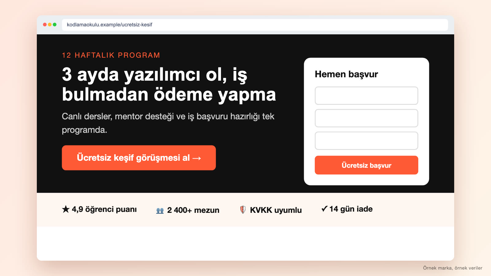
Present the action the page is built around with a clear button. The button text should say what the user will get: “Get a free quote,” “Book my appointment,” “Start the trial” instead of “Submit.” The button should be visually prominent, high-contrast and repeated at several points on the page (top, middle and end), but all of them should lead to the same action.
8. The form
On pages that collect leads, the form is the heart of conversion. Keep the form as short as possible: Every extra field can lower the completion rate. In the first stage, ask only for what is truly needed (name, phone or email); collect the details in a later step. Label the fields clearly, bring up the right keyboard types on mobile, write error messages plainly, word the submit button around the benefit, and give privacy and data use information below the form.
Writing persuasive copy
- Speak to the visitor: Use “you” language; describe problems and goals in their words.
- Be clear and concrete: Instead of “quality service,” say what is good and how.
- Write for scanning: Short paragraphs, subheadings, bullet points, bold emphasis.
- Deliver one message: Don’t squeeze many offers onto the same page.
- Be honest: Exaggerated promises and misleading claims damage both trust and legal compliance.
- Use urgency honestly: If there is a real campaign deadline or stock limit, say so; fake countdowns and made-up scarcity messages cost you trust.
- Check grammar and spelling: Turkish-character and spelling errors reduce trust.
Grounding your message in positioning increases consistency (see our brand positioning guide). You can use AI tools for copy drafts, but have a human review the message for accuracy and brand fit (see AI content production).
Matching the ad and the page message
One of the most common landing page mistakes is a mismatch between the ad and the page. If the ad says “20% off,” the page should show that discount right away; if the ad shows a specific product, the page shouldn’t open to a general product list. The headline, image and offer should match the ad, and the visitor should feel “I’m in the right place” in the first second. Sending different ad groups to different pages makes message match easier to achieve. For ad setup, see our Instagram ads and Google Ads guides.
Speed and mobile-friendliness
Visitors reach a landing page from mobile too, which is why page speed matters. Google treats the main content of a page (LCP) loading within 2.5 seconds for at least 75% of visits as the threshold for a good experience (web.dev). Speed shows up in sales too: When Vodafone Italy improved this metric by 31%, its sales rose 8% (web.dev case study). On a slow page, the budget you pay per click goes to waste. For speed, compress images, cut unnecessary scripts and plugins, avoid heavy video and animation, and use good hosting. On mobile, buttons and form fields should be large, text legible and the call to action on the first screen or within easy reach; tapping the phone number should start a call. Measure the page’s performance regularly with free testing tools (the speed section of our corporate website guide may also help).
Design principles
- Single focus: Reduce or remove the menu and outbound links.
- Clear hierarchy: Make the headline, main benefit and call to action the most visible elements.
- White space and simplicity: Strip out distracting elements.
- Contrast: The call-to-action button should stand out clearly from the rest of the page.
- Consistent brand language: Colors, typeface and image style consistent with the brand (see our corporate identity guide).
- Accessibility: Sufficient color contrast, legible text, alt text and keyboard use.
- Trust elements: Make contact details, the privacy link and security indicators visible.
For interface and experience principles, see our UI/UX guide.
Legal requirements
If a landing page uses forms or cookies, personal data protection rules apply. Add a link to the privacy policy and the privacy notice on personal data protection below the form; offer explicit consent or commercial message consent checkboxes where needed. Under Law No. 6563 (the Turkish E-Commerce Law), prior approval is required to send commercial messages; if the recipient declines, sending must stop within three business days (mevzuat.gov.tr); don’t treat consent as obtained through pre-checked boxes. Provide cookie notices and preference options for analytics and ad tracking tools. Prices, discounts and promises must be accurate and not misleading; campaign terms should be clearly written. Regulations change over time and differ by industry; seek legal support in unclear situations.
Improving with A/B testing
Even a good page can be improved by testing. An A/B test randomly shows two versions of the same page (A and B) to visitors and measures which one brings more conversions.
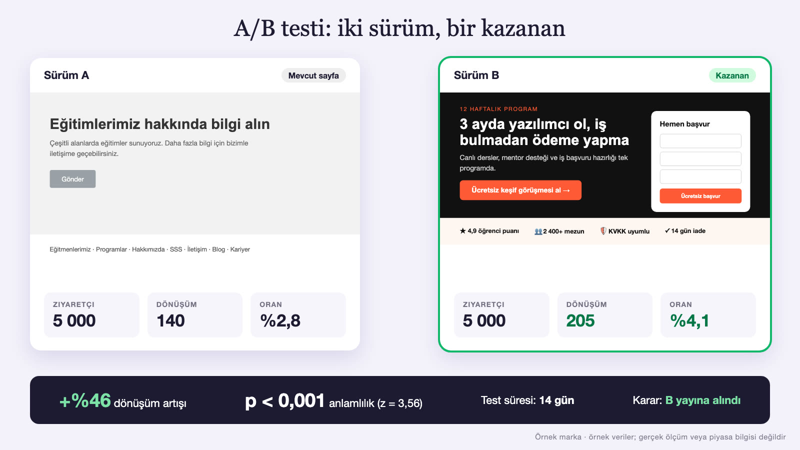
What can you test?
- Headline: A different emphasis on benefits or different phrasing.
- Call to action: Button text, color, position and size.
- Form: Number of fields, field order and explanations.
- Image and video: Different product images, or the presence of a video.
- Social proof: Placement and format of reviews.
- Offer: A different discount, guarantee or free trial format.
- Page length: Short or long version.
What to watch for in A/B testing
- Test one variable: If you change many things at once, you can’t tell which one made the difference.
- Form a clear hypothesis: For example: “If we emphasize the price advantage in the headline, conversion will rise.”
- Collect enough data: Tests run with very few visitors can mislead; don’t declare a result too early.
- Give it enough time: Cover different days of the week; account for seasonal fluctuations.
- Record the results and learn: Even without a winner, what you learn from the losing version is valuable.
For businesses with limited traffic, A/B tests deliver results slowly; in that case it can be more efficient to test large, bold changes or to learn qualitatively through user interviews and session recordings.
Measurement: Conversion rate and metrics
Conversion rate shows how many of the people who visit the page take the targeted action: the number of conversions divided by the number of visitors. For example, if 50 of 1,000 visitors fill out the form, the conversion rate is 5%. A good conversion rate varies greatly by industry, traffic source, offer and page type, so rather than looking at general “average” figures, focus on improving your own past results.
- Number and rate of conversions: The main measure of success.
- Cost per conversion: Ad spend divided by the number of conversions.
- Traffic sources: Which ad, email or channel converts better?
- Device breakdown: Differences in mobile and desktop conversion.
- Page behavior: Scroll depth, click map, form abandonment rate, time on page.
- Lead quality: How many of the incoming requests actually turn into sales; look at quality, not just quantity.
Conversion tracking is set up with events such as a form submission or a thank-you page visit; test that it works before running ads. For the general measurement framework, see our digital marketing guide.
Tools and templates
Searches for “landing page template” come from people looking for a ready-made solution. There are several ways to create a landing page:
- Landing page builders: Let you build pages quickly with ready-made templates in a drag-and-drop style; they can offer A/B testing and form integration. Good for a quick start.
- A custom page on your website platform: Adding a dedicated page to your existing site; an advantage for brand consistency and SEO.
- Custom design and coding: For high-budget campaigns and special needs; the most flexible and most costly option (see our pricing guide).
When using a template, adapt its style to your brand and message; templates used as they are look ordinary. Templates are for getting started; the page should carry an original message prepared for your target audience.
Landing pages and SEO
Landing pages built for ad traffic usually don’t aim to rank in search engines; in that case some pages are excluded from search results. But if you are also building landing pages for organic traffic, you need to set them up to be SEO-friendly: Use the keyword naturally in the title and copy, write a unique title and description, avoid duplicate content, and make the page fast and mobile-friendly. If you have many similar pages used for ads, plan which ones to index and which not to, so they don’t create a duplicate-content problem in search engines (our SEO guide).
Should the page be short or long?
There is no single answer to “What is the best landing page length?”; the decision depends on the product’s complexity, its price and the visitor’s level of hesitation. For a low-risk, simple offer (a free e-book, a newsletter, a small product), a short page is enough: headline, short benefits, form. For higher-priced, new or explanation-heavy offers (a custom service, an expensive product, a long commitment), visitors have more questions and hesitations; in that case a longer page with sections such as process, proof, FAQ and guarantee builds more trust. The measure of length isn’t how long the page is, but whether the visitor has all the information they need to make their decision. Even on long pages, repeat the call to action in a few places and keep the sections scannable.
Landing page ideas by industry
- Local services (clinic, hair salon, repair shop): Location, phone and map; an appointment form, reviews and working hours stand out.
- B2B services (agency, software, consulting): Case studies, client logos, process and a call to action for a free consultation or demo.
- E-commerce product campaign: Product images, price and delivery information, reviews, an add-to-cart button and a time-limited offer (if it is real).
- Education and courses: Curriculum, instructor, student reviews, a sign-up form and FAQ.
- Event and webinar: Date, speakers, program, a short sign-up form and a countdown.
- Mobile app: Screenshots and a short video, main benefits, store buttons and a QR code.
- Real estate and construction project: Project visuals, location, plan and unit details, an appointment and information form.
The common principle in every industry is the same: Show the visitor what they are curious about right away, back trust up with proof and present a single clear next step.
Common mistakes
- Multiple goals: Asking for purchase, newsletter sign-up, contact and a blog visit all on the same page.
- Menus and distracting links: Giving the visitor a way to leave the page.
- A mismatch between the ad and the page.
- Vague headline: Failing to say what is offered at a glance.
- Feature-focused copy: Not describing the benefit.
- A long, complicated form: Unnecessary fields.
- Weak or fake social proof.
- A slow page that is broken on mobile.
- Not setting up measurement: Not knowing which traffic and which version work.
- Not testing, and building the page once and leaving it.
- Skipping legal notices and consents.
- Neglecting the thank-you page: Leaving the visitor in uncertainty after the form.
Example scenario: A foreign language school
This is a fictional example; it is not based on a real school or a real result. A foreign language school is running ads for a new evening group aimed at adults who want to practice speaking English at work. At first the ads send people to the school’s home page, but visitors get lost among language levels, class schedules and the instructor list, and few reach the sign-up form.
The new landing page: The school builds a single-purpose page for the ad. Headline: “Speak with confidence in business meetings: An 8-week evening group.” Subheadline: “Practice in small groups with everyday work scenarios.” On the right is a real photo showing the school’s classroom setting. Below it are three benefits (a small group, business-focused content, flexible evening hours), participant reviews, a short introduction of the instructor and four steps in the “how it works” section: fill out the form, have a level-assessment call, choose your group, start classes.
Form and call to action: The form contains only name, phone and current English level fields; the button says “Schedule my free level call.” Below it are a short privacy note and a link to the privacy notice. The page has no menu; it has only the logo and a phone number.
Measurement and testing: Form submissions and phone clicks are tracked as conversions. In the first two weeks, the call to action is also added to the top of the page so the form is visible on mobile. In an A/B test, two headlines are compared, one highlighting “8 weeks” and the other the “free level call”; the second headline brings in more visitors who fill out the form and becomes the main version.
Targeted outcome: The aim is for the number of call requests from the same ad budget to rise and the cost per request to fall. The school applies the same method to its other groups and builds each campaign its own page.
In this scenario the reason for the increase is not the size of the ad; it is a single-purpose page matched to the ad, a short form, trust elements and improvements based on the data.
Landing page checklist
- Does the page have a single goal and a single main call to action?
- Does the headline describe the benefit and match the promise in the ad?
- Does the hero image or video show the product/service clearly?
- Are three or four main benefits presented in a scannable way?
- Is there real, verifiable social proof (reviews, client references, numbers)?
- Are objections answered with the process (“how it works”) and the FAQ?
- Is the call-to-action button prominent, high-contrast and written around the benefit?
- Is the form short, clearly labeled and mobile-friendly?
- Have the menu and distracting links been reduced?
- Does the page load fast and work smoothly on mobile?
- Are the privacy policy, privacy notice and cookie disclosures ready?
- Has conversion tracking been set up and tested?
- Have the thank-you page and the next step been planned?
- Is there an A/B test plan and an improvement calendar?
If you want conversion-focused pages built for your campaigns and managed together with ads and measurement, take a look at our digital advertising and web services.
Mini glossary: Landing page terms
- Landing page: The single-goal page where the visitor first lands.
- CTA (call to action): A button or phrase that leads the visitor to the targeted action.
- Conversion: The visitor completing the targeted action.
- Conversion rate: The ratio of the number of conversions to the number of visitors.
- Lead: A person who has shown interest in the product or service and provided contact details.
- Hero area: The section at the very top of the page containing the headline and main image.
- Social proof: Reviews, ratings and client references showing other people’s positive experience.
- A/B test: A method of comparing two versions to pick the better one.
- Message match: Consistency between the ad and the page.
- Thank-you page: The confirmation and next-step page shown after a conversion.
Frequently asked questions
What is a landing page?
A landing page is a dedicated page, free of distracting elements, built to send a visitor arriving from an ad, email or link toward a single goal (filling out a form, buying, signing up, calling).
What is the difference between a landing page and a home page?
A home page introduces the business in general and leads in many directions. A landing page focuses on a single offer and a single action, usually has no menu, and is matched to a specific campaign or ad.
How do you build a landing page?
First you set a single goal and target audience, write a clear headline that matches the ad, add benefits, social proof, process and FAQ, prepare a short form and a prominent call to action, make the page fast and mobile-friendly, set up conversion tracking and improve the page with A/B tests.
What is a good conversion rate?
It varies greatly by industry, traffic source, offer and page type; there is no universal “good” rate. The healthiest approach is to measure your own current rate and improve it through testing.
How many fields should a landing page form have?
As few as possible: In the first stage, ask only for what is truly needed (usually name and phone or email). Every extra field can lower the completion rate; detailed information can be collected in a later step.
Is it right to use a ready-made template to build a landing page?
It’s fine for a quick start, but you should adapt the template to your brand, message and target audience. Templates used as they are look ordinary and can limit conversion.
Conclusion
A landing page is one of the most important links in getting a return on your ad and campaign investment. A message that focuses on a single goal, is consistent with the ad, is benefit-focused and builds trust; a short form and a clear call to action; a fast, mobile-friendly experience; legal compliance and regular measurement all raise the likelihood of turning a visitor into a customer. Rather than building the page once and leaving it, continuously improving it by learning from data and testing is the most reliable way to get more results from the same budget.
This article was prepared with AI support. The images in the article are sample screens drawn with code; they don’t show a real client, person, place or data.
Related work
A few examples of Media Fish’s work on this topic:
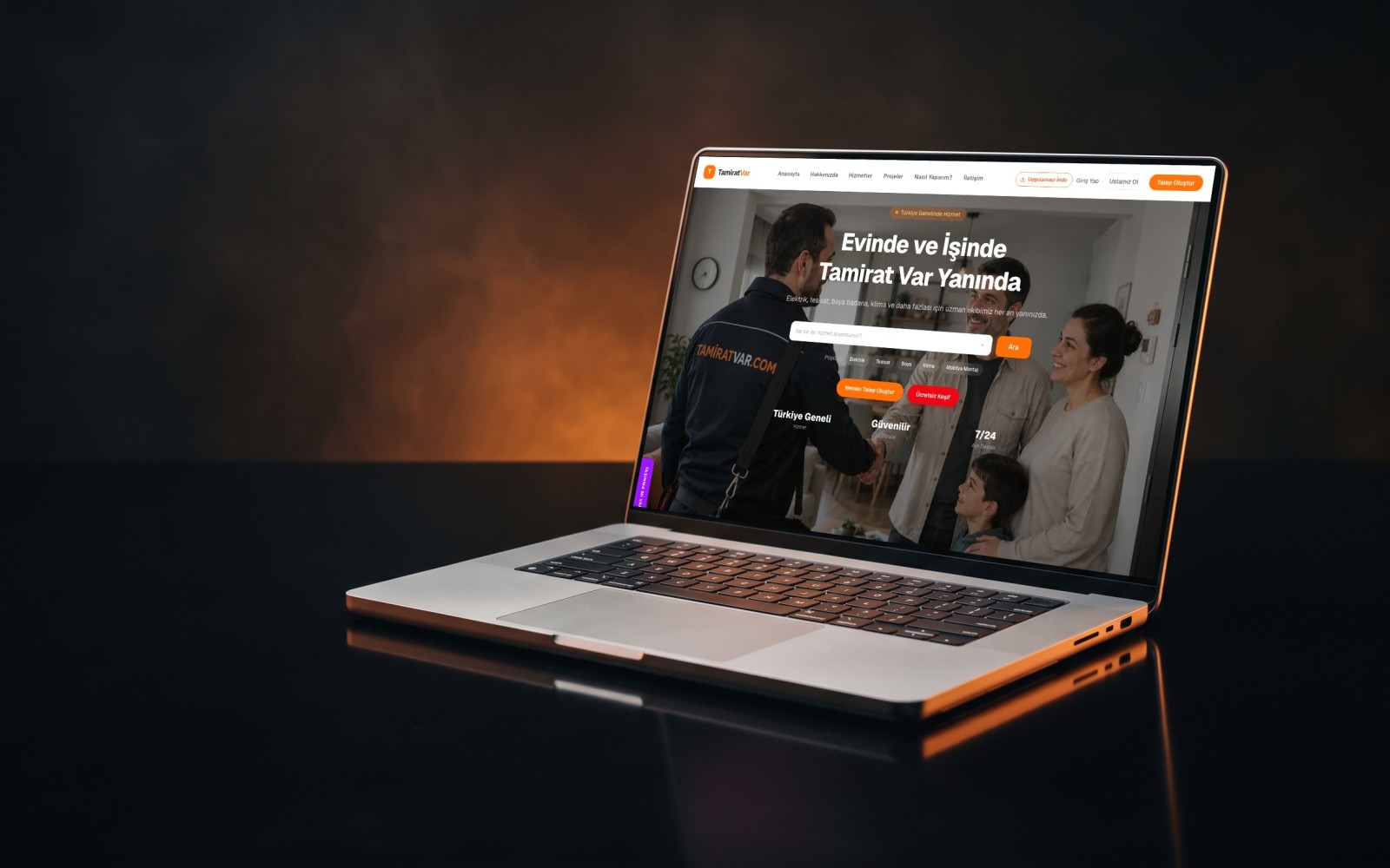

E-Commerce Site + SEO + SEM
Design · Software · Publishing

Corporate Website + SEO
Design · Software · Publishing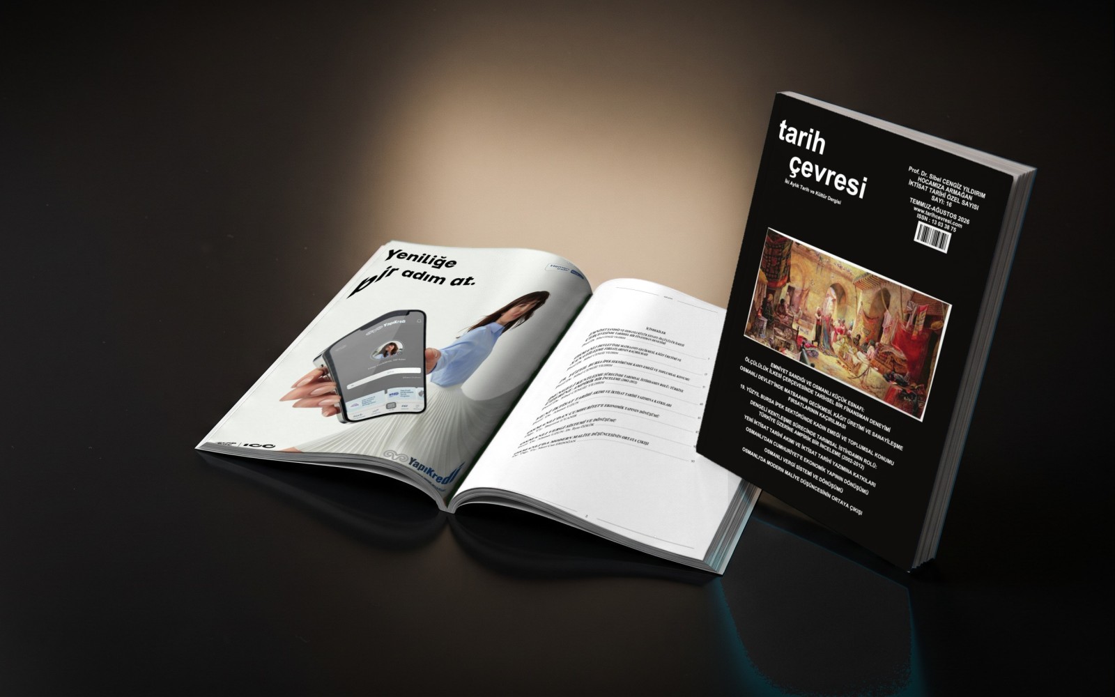

Print Publication
Typesetting · Design · Print
Software Engineer, Media Fish. Writes on our blog about web and software, mobile apps, artificial intelligence and search engine optimization (SEO).